Friday, June 17, 2011

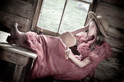
Final Poster: Saloon Princess


Title: Saloon Princess (18x24)
Date: 5.25.11; 1:11 pm
Location: Bannack Ghost Town
Camera: Nikon D3100
Settings: F Stop: f/5.3; Shutter Speed: 1/30 sec
Edits: In Camera Raw, I decreased the saturation and increased the exposure. Then I used the adjustment brushes to darken the background and lighten her face. I also added a vignette. In Photoshop, I smoothed out her face with the brush tool, darkened the details of her eyes also with the brush tool on color burn mode. I used an adjustment layer to change the color balance, then used the mask to take it out of the background. I brought in the same photo without the Camera Raw edits and cut out the window so that it wouldn't be over exposed and pasted it to the new image.
Process: I chose this image because I think it's different than anything else I have done so far this semeser. It was a happy accident, as she was sitting there when I walked into the Saloon, and it wasn't that great of an image before I edited it. I love how I was able to turn it into something special with the techniques I've learned in class.I like the angle, and the details like her boots and stringy hair. Taking portraits at Bannack was the best part of the trip.
Printing it was crazy. I went through several stages of edits, and it still printed with less color than I anticipated, but luckily, I had increased the sats more than I had originally, so it worked out ok.
Monday, June 13, 2011

Night & Light


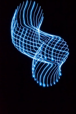
Camera in Motion; 6/7/11, 10:18 pm; Rexburg, Idaho; f/36; 3 sec; Nikon D3100


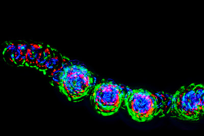
Magic Top; 6/9/11, 11:16 pm; Rexburg, Idaho; f/25; 5 sec; Nikon D3100; slightly increased the saturation in Camera Raw

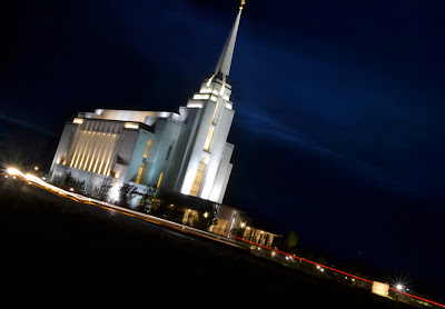
Templelights; 6/8/11, 10:03 pm; Rexburg, Idaho; f/29; Nikon D3100; 15 sec; tripod; combined two pictures so I could get the blue in the sky, added a mask and blended them in Photoshop


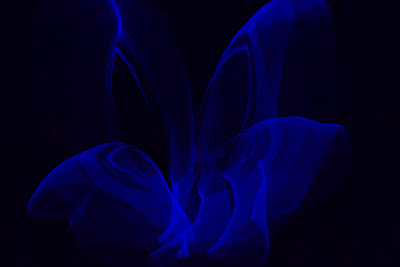
Butterfly1; 6/9/11, 10:46 pm; Rexburg, Idaho; f/14; 8 sec; Nikon D3100; tripod; increased the blues in Camera Raw


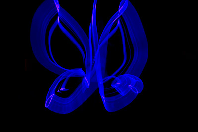
Butterfly2; 6/9/11, 10:47 pm; Rexburg, Idaho; f/11; 13 sec; Nikon D3100; tripod; increased blues in Camera Raw


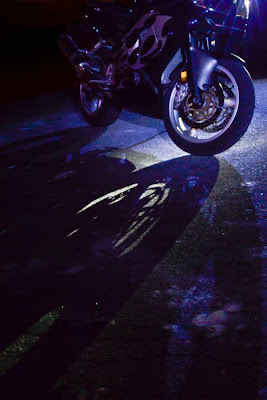
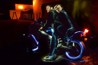
Lightbike; 6/10/11, 11:30 pm; Rexburg, Idaho; f/20; 20 sec; Nikon D3100; tripod; increased the exposure in Camera raw, used an adjustment brush to darken the corner

Tron Effect; 6/10/11, 11:59 pm; Rexburg Idaho; f/29; 15 sec; Nikon D3100 tripod; increased exposure and used adjustment brush in Camera Raw to darken the background

Dumpster Hug; 6/10/11, 12:10 pm; Rexburg, Idaho; f/7.1; 15 sec; Nikon D3100; tripod

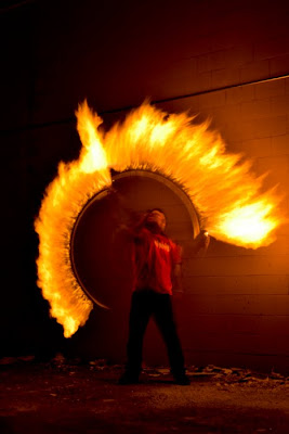
Fire Circle; 6/10/11, 10:38 pm; Rexburg Idaho; f/25; 15 sec; Nikon D3100; tripod. Increased blacks in Camera Raw.

I wasn't looking forward to this project, but I ened up having a lot of fun and I learned some cool tricks. On Camera in Motion, I used a tent light and discovered it was actually better to move the camera slow so you could get a distinct design. I used kind of the same technique with the glo-sticks on the butterfly pictures. The first one I think is really cool. I had the glo-stick held out straight so that the tip was free to move around. The second time I folded the stick up so there was a point of light. The magic top was cool. I liked when it moved across the camera screen so we started the top, and nudged it to get the effect. The lightpainting was crazy and I think we developed a new way to paint. Instead of standing back and holding lights on the subject, we stood right by the subject and moved the lights around the outline. Brandon came up with the idea, and Sara T's are better, so check out her blog. As we experimented we figured out what we liked. We found out it was better to have a large aperture (small numbers) to let in more light. It made a HUGE difference.

Thursday, June 9, 2011

Fine Art Template


Ladybug; 5/6/11, 2:33 pm; Rexburg Idaho; f/5.6; 1/60 sec; Nikon D3100. Saturation and blacks increased in Camera Raw. I used adjustment brushes to darken the background, sharpen the ladybug, and brighten up the center of the plant.
To make the template, I opened an 18x12 document, then used the shape tool to create a rectangle. I used opt+command+t to get the free transform tools, then held shift and dragged a new shape over to the side. Then I held shift+opt+comm+t and created 3 more rectangles. To insert the photo, I put it on a new layer, then held opt in between the layers. I adjusted the picture, then used the spot heal tool to get rid of some dry water spots on the petals.

Tuesday, June 7, 2011

Pano Scanography


I really wanted to try the 'snowflake' thing, that's why I originally thought of sewing supplies, but I didn't have time to add it to the assignment. But as I was looking for the tutorial, I thought of this. It helped that I did the Fine Art Template, which explained how to copy a shape. So I selected the different objects, brought them into a new, square document, then made them into panos under filter, distort, polar coordinates. I didn't expect the curve effect, but I think it turned out fun!

Monday, June 6, 2011

Scanography


Lilac: I scanned the flower on an hp deskjet 4235. I put a box over the scanner to block the light. I increased the saturation and contrast of this image in Photoshop.

Sewing Essentials: I scanned each image on an hp deskjet 4235. When I brought them into Photoshop, I increased the saturation of the images, as well as the contrast. To compile the images, I brought them all to a new, blank document. Then I added masks to each one. I decreased the opacity on just the tape measure. I masked out the backgrounds of each image.


Family; First I increased the saturation and contrast in Camera Raw, then brought all the images into Photoshop. Instead of layering them all before masking them out, I started with the blocks as the background and added one image at a time, resized and decreased the opacity, then added a mask and masked out the black.


Edge Effects

BURNED BORDER
In Photoshop, I added the border by copying the layer and selecting the 'multiply' blending mode. Then I selected an area inside the frame with the rectangle marquee, then deleted the middle. I added a white stroke on the background layer while I still had my selection, then added text.
Bear Lake Branch; 6/3/11, 10:18 am; Garden City, Utah; f/5.6; 1/1250 sec; Nikon D3100; Increased saturation and contrast in Camera Raw.

DOUBLE FADE BORDER
To add this border, first I increased the canvas size by one inch on both sides and filled it with white. I used the rectangle tool and selected an area inside the border, while making sure the 'shape layer' is highlighted at the top. Then I added a mask to the shape layer, changed 'shape layer' to 'fill pixels', and drew a rectangle inside the other one. I changed the opacity to 60%, then while I was still selected on the inside rectangle, I put a motion blur on the edge at angles 0 and 90 at 45 px distance each.

Wishing Flower; 6/3/11, 11:01 am; Garden City, Utah; f/5.6; 1/2500 sec; Nikon D3100; increased saturation and contrast in Camera Raw.

FLEXIBLE BRUSHED-ON EFFECT
First, I added a new layer and filled it with white. Then I unlocked the image layer and moved it to the top. I added a black mask by holding alt as I selected the layer mask icon. Using 'thick, heavy brushes' from the brushes palette, I used brushes #3, #2, and #5 to paint back the image, changing the opacity as I went. It took me a while to get it to look the way I wanted, since I used the mask, it was easy to paint back the white with the mask.

Lydia Jane; 5/31/11, 4:16 pm; Rexburg, Idaho; f/5.6; 1/100 sec; Nikon D3100; In Camera Raw I brightened her face with an adjustment brush, and darkened the background. I also increased the saturation and blacks.